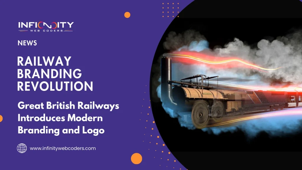
A Fresh Logo and Branding for the Future of Great British Railways
UK Government Unveils New Branding for Great British Railways
The UK Government has introduced a fresh identity for Great British Railways (GBR), marking a major step in the shift towards a nationalized rail system. This revival builds on the legacy of the original British Rail, which was privatized in 1997, and aims to offer a modern, cohesive image while symbolizing renewed hope for the future of UK rail transport.
Simplicity and Timelessness at the Core of the Logo
Effective logos are often simple yet memorable, designed for versatility and longevity. The new Great British Railways identity follows these principles, sparking debate across the nation. While some praise its minimalist approach, others feel it lacks dynamism and character.
Heritage Honored Through Iconic Double Arrow
The updated GBR logo retains the classic double-arrow emblem from the original British Rail, reflecting its historical roots. The design conveys movement and progress, key elements of the new railway system. The red, white, and blue color scheme offers a patriotic nod to the Union Flag, integrated thoughtfully to maintain sophistication without appearing overly nationalistic.
Public Opinion Divided Over New Design
Despite its relatively simple design, the new branding has been controversial among the public. Some users on Reddit criticized the inner coach livery as “loud” and “distracting,” suggesting the design feels more American than traditionally British. Others commented that the heavy use of national colors weakens the design, lacking the boldness and elegance that made the original British Rail logo timeless.
Conclusion: A Modern Look with Mixed Reactions
The launch of Great British Railways’ new logo reflects a careful balance of heritage and modern design. While it aims to represent progress and national unity, public reception remains mixed, highlighting the challenge of evolving a beloved and iconic brand.